

You have about 50 milliseconds
That is not a typo. Research shows it takes as little as 50 milliseconds for a visitor to form an opinion about your website. And that opinion shapes everything that follows. For bookkeepers, where a potential client is deciding whether to trust you with their finances, those first fractions of a second carry real weight.
Your homepage is not just the front door to your website. It is doing active work: communicating who you are, who you serve, and whether you are worth a second look. When it is built well, it earns that second look. When it is not, potential clients move on without ever knowing what you could have done for them.
Here is what every bookkeeper website homepage needs to have to do that job well.
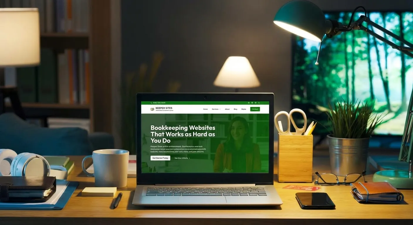
A headline that says exactly what you do
The first thing a visitor reads should answer one question: am I in the right place? A strong homepage headline names who you help and what you do. It does not say “Welcome to my website” or “Solutions for your business.” It says something specific, like “Bookkeeping services for small business owners in Nashville” or “Monthly bookkeeping so you can stop dreading tax season.”
Vague headlines make visitors work harder than they are willing to. If they cannot tell within a few seconds what you do and whether it applies to them, they are gone. Be direct. Be specific. Save the personality for the copy that follows.
A clear call to action above the fold
Above the fold means what a visitor sees before they scroll. On most bookkeeper websites, that is the headline, a subheadline, and a button or link that tells them what to do next. That button matters more than most bookkeepers realize.
Your call to action should be specific and low-friction. “Schedule a free consultation” works better than “Learn more” because it tells the visitor exactly what happens when they click. Make it easy to find, easy to read, and impossible to miss. A potential client who is ready to reach out should never have to hunt for a way to do it.
A brief introduction to who you are
Bookkeeping is a trust business. People are handing over access to their financial records, their bank accounts, and their peace of mind. They want to know who they are hiring before they ever pick up the phone.
Your homepage does not need a full biography, but it does need a human introduction. A photo, your name, and 2 or 3 sentences about who you help and why you do this work goes a long way. It moves you from “a bookkeeping service” to “a real person I might want to work with.” That shift is what turns a curious visitor into someone who reaches out.
A summary of your services
Visitors should not have to click through multiple pages just to understand what you offer. Your homepage should give a clear, scannable overview of your services. Not a full description of each one, but enough to confirm that you do what they are looking for.
Think of it as a menu, not a manual. A short headline for each service, a sentence or two of description, and a link to learn more is all you need. The goal is to help the right client recognize themselves quickly and move forward.
Social proof from real clients
Testimonials are one of the most powerful trust signals on any homepage. A Stanford University study found that 75% of consumers judge a business’s credibility based on its website design, and testimonials are a major part of what makes a site feel credible. A real quote from a real client does something no amount of polished copy can: it proves that someone else already took the risk and was glad they did.
Aim for 2 or 3 testimonials on your homepage, and choose ones that speak to specific outcomes. “She cleaned up 3 years of messy books in one month” is more convincing than “Great service, highly recommend.” Include the client’s name and business when possible. Specificity is what makes social proof actually work.
A simple, visible way to contact you
This sounds obvious, but it is one of the most common failures on bookkeeper websites. Your phone number or contact link should be visible without scrolling, ideally in the header. A potential client who has to search for a way to reach you will often give up before they find it.
Your homepage should also include a second contact prompt at the bottom, after the visitor has had a chance to read about you and your services. Catching them at both ends of the page gives them two natural moments to take action instead of one.
A design that does not get in the way
A great homepage design is not flashy. It is clear. Clean layout, readable fonts, consistent colors, and professional photography all work together to create a first impression that builds confidence rather than doubt. Nothing on the page should distract from the main goal, which is getting the right visitor to reach out.
Avoid clutter. Avoid walls of text. Avoid design choices that prioritize style over clarity. The bookkeepers whose homepages convert best are the ones whose sites feel effortless to use, because that feeling transfers to how a potential client imagines working with them.
The bottom line
Your homepage is working around the clock, making first impressions on potential clients you will never know visited. Every element on that page either builds confidence or erodes it. A clear headline, a visible call to action, a human introduction, a service overview, genuine testimonials, easy contact options, and a clean design all work together to do one thing: give the right visitor a reason to reach out.
If your current homepage is missing any of these, it is likely costing you clients who never introduced themselves.
Keeper Sites builds done-for-you websites exclusively for bookkeeping professionals, with every one of these elements built in from the start. Get in touch today to see what’s possible.
Get Started Today